Color





































Color PFP – Identity Through Tone, Mood, and Visual Recognition
Color PFP is one of the most important parent hubs in the entire avatar system because color is often the first thing people feel before they fully understand an image. A profile picture built around color does not only create style. It creates immediate emotional direction. Black can feel clean, powerful, distant, or minimal. Pink can feel warm, playful, soft, or expressive. Purple can feel dreamy, cosmic, mysterious, or elegant. Blue can feel calm, cold, sharp, or emotionally controlled. That emotional speed is exactly what makes color-based avatars so effective.
Unlike character hubs that rely on a known figure, or platform hubs that depend on interface context, Color PFP works through visual atmosphere first. Users come here because they want a profile picture that feels a certain way. Some want darkness and clarity. Some want softness and warmth. Some want deeper mystery, stronger energy, or more emotional control. A strong color avatar can communicate that almost instantly, even before the viewer studies the full image.
That is why Color PFP needs to function as a real parent hub. It is not one flat category. It contains multiple color identity paths, each with its own mood logic and profile behavior. The purpose of the parent page is to make those routes visible, organized, and easy to explore so users can move from broad color intent into the exact tone that fits their account best.
Why Color-Based Avatars Work So Well for Profile Pictures
Color-based avatars work because color is one of the fastest emotional signals in visual identity. Before someone processes the details of a face, character, or object, they often process the dominant tone first. This makes color extremely powerful in profile environments where the image appears small, briefly, and repeatedly. A good Color PFP can set the emotional temperature of an account in less than a second.
There is also a strong memorability advantage. When a profile repeatedly appears with a consistent color identity, it often becomes easier to recognize. The account starts to feel visually anchored. That makes color a practical identity tool, not just an aesthetic one. A strong color-driven avatar can help the profile feel more intentional and more stable across repeated interaction.
Another reason color avatars work so well is flexibility. A user does not always want a specific character or a literal concept. Sometimes they want a profile that feels dark, soft, bright, rich, dreamy, or emotionally strong without attaching themselves to one symbolic figure. Color lets them do that while still building recognizable visual identity.
Color PFP as a Parent Identity Hub
The Color PFP hub should function as a discovery page first and a gallery second. Its main role is to show that different color paths create different kinds of profile identity. Some users arrive already knowing they want a black PFP. Others only know they want something warmer, darker, softer, more cosmic, or more emotionally calm. The parent hub exists to organize those paths into a usable identity map.
That is why the child pages are so important. Black PFP supports darker minimalism, control, and stronger contrast. Pink PFP supports warmth, sweetness, softness, and more emotionally inviting profile energy. Purple PFP supports dreamy, cosmic, and more mysterious identity. Blue PFP supports clarity, coolness, emotional restraint, and stronger visual calm. Black Girl PFP introduces a more identity-specific route where color and representation intersect, creating stronger personal and visual presence. These pages are different lanes, not minor variations.
By bringing them together, the parent hub defines Color PFP as a true taxonomy of mood and tone. It helps both users and search systems understand that color-based profile identity is structured, intentional, and broader than any one shade alone.
Representative Color PFP Gallery
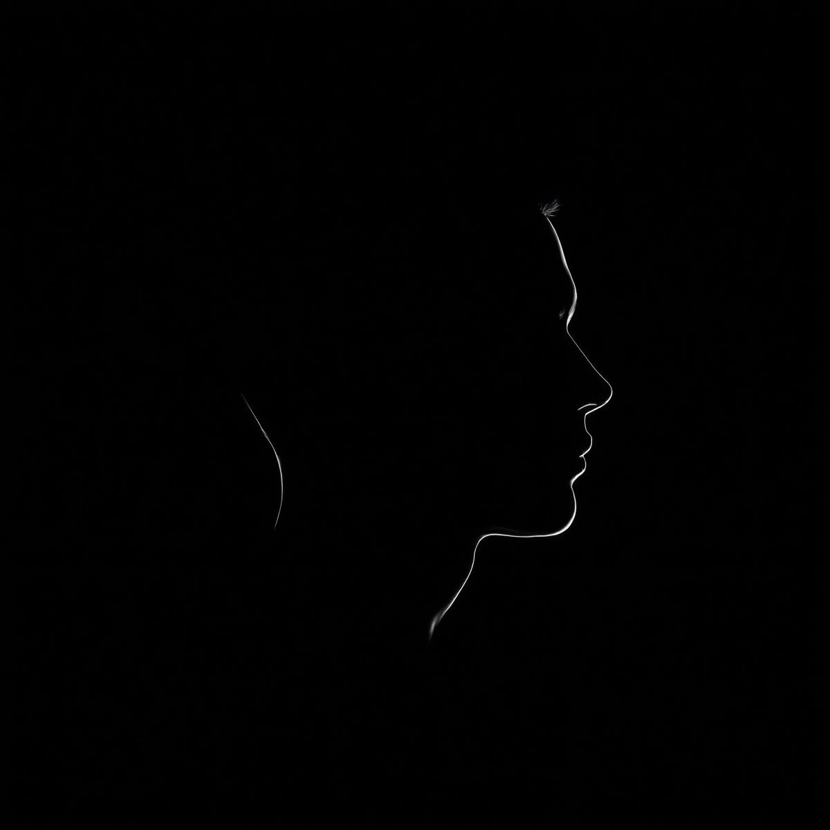
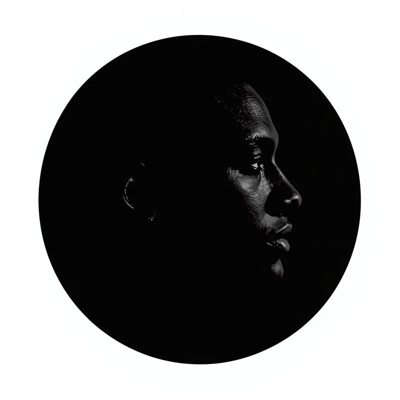
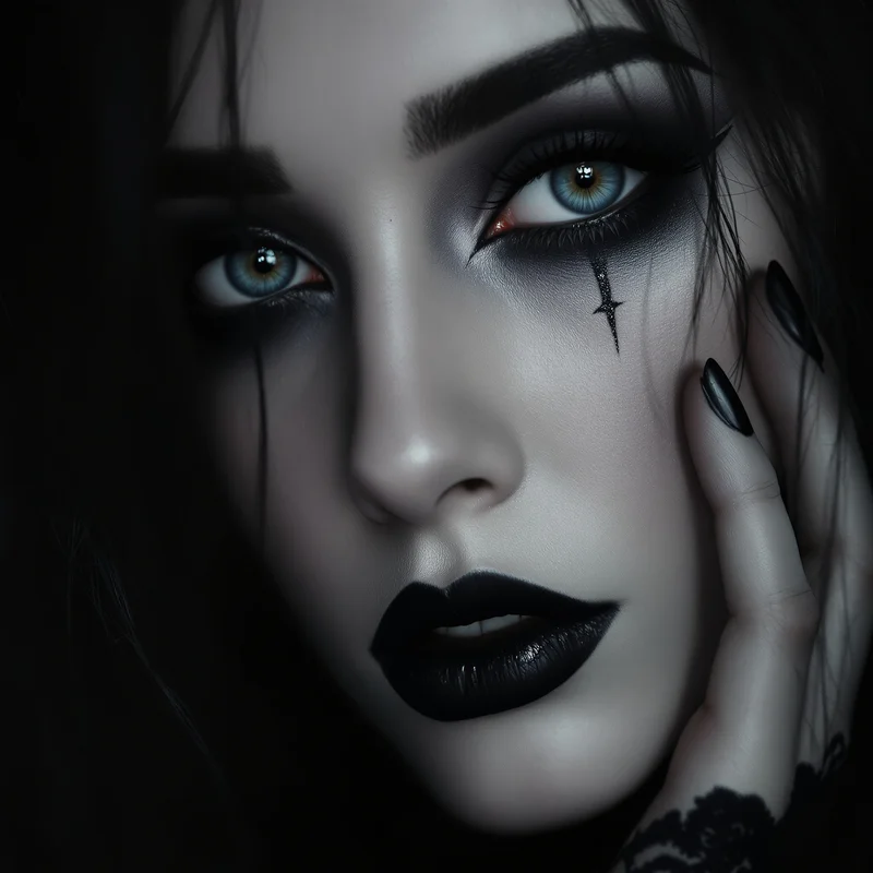
This kind of color avatar gives the profile a darker and more controlled emotional signal, helping it feel sharper and easier to remember.
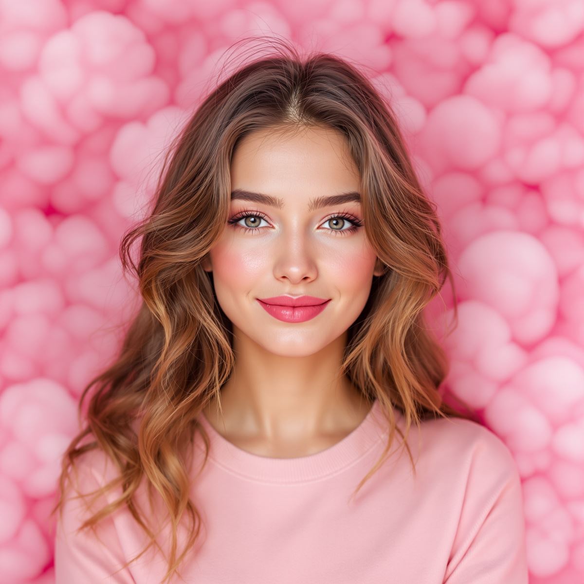
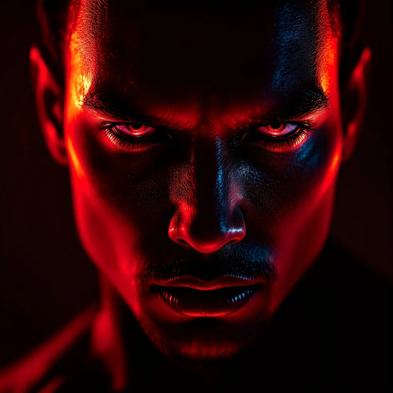
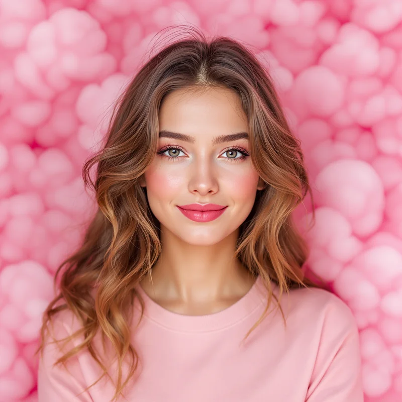
A warmer color direction like this helps the account feel softer, friendlier, and more emotionally inviting without losing clarity.

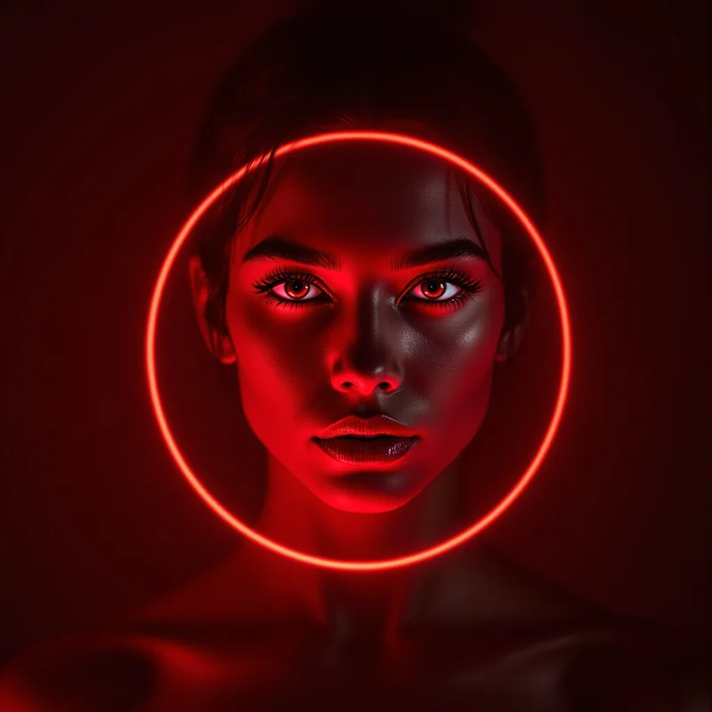
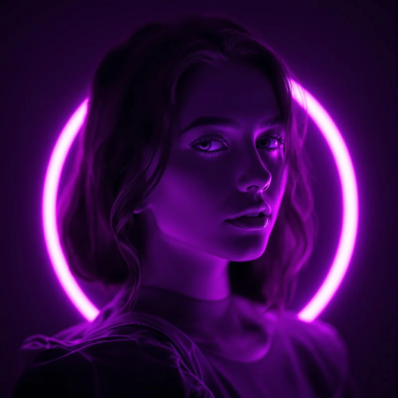
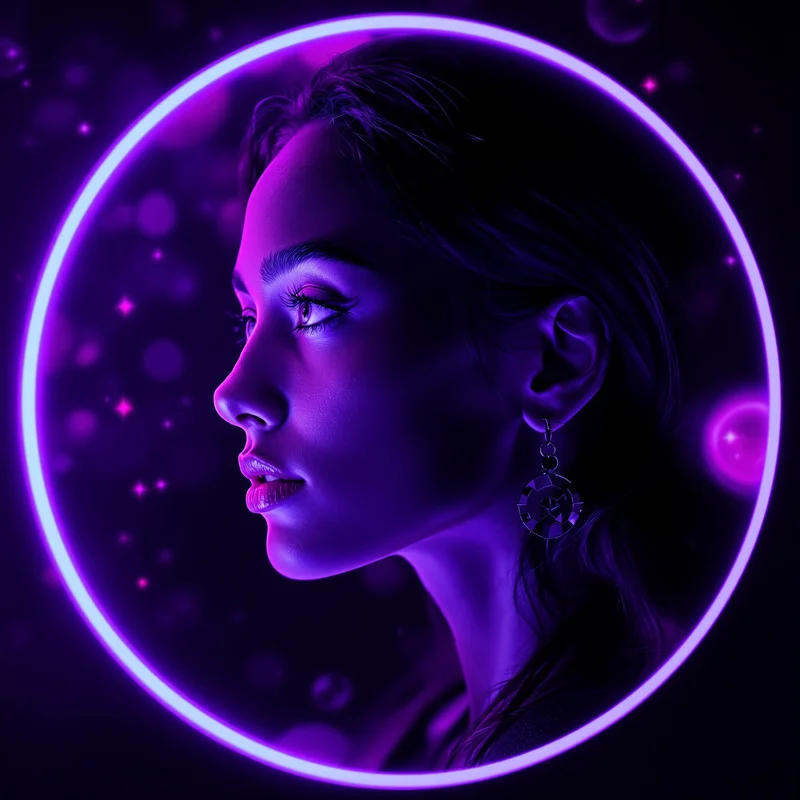
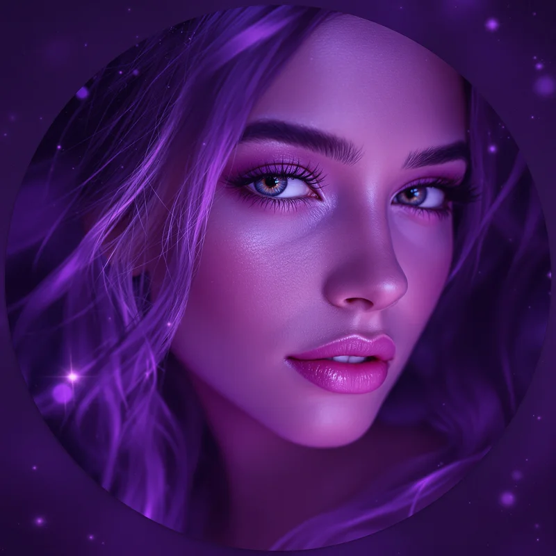
This profile style adds deeper mystery and dreamier atmosphere, making the avatar feel more imaginative and more visually rich.

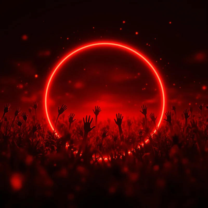
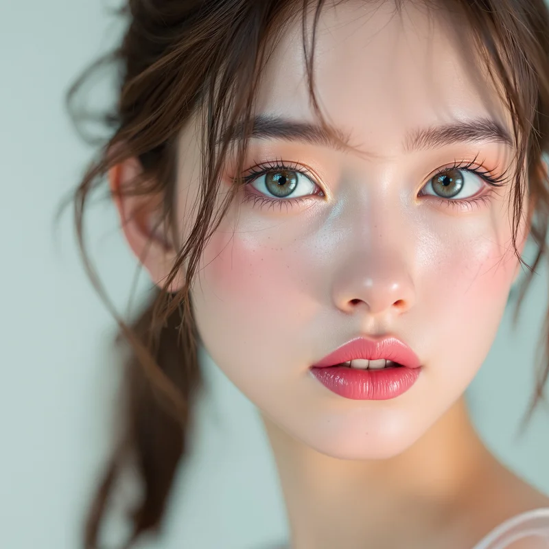
An identity-led color image like this brings stronger personal presence, helping the profile feel more grounded, more visible, and more direct.

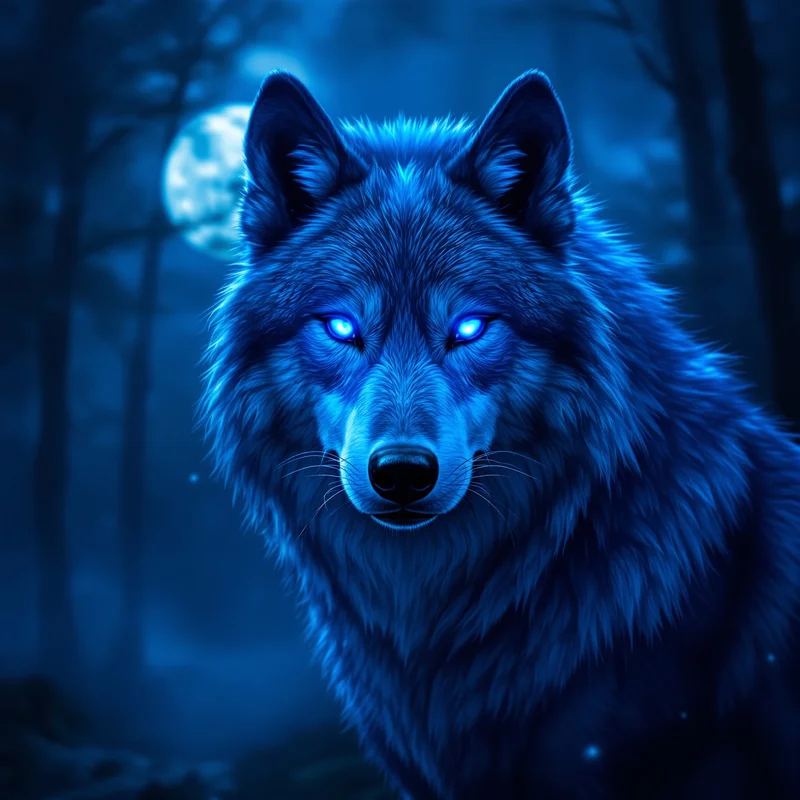
A blue-toned direction like this creates more coolness and emotional control, helping the profile feel cleaner and more defined.
Core Color Identity Paths Inside This Hub
Each child hub inside Color PFP serves a different emotional route. Black PFP supports control, distance, minimalism, and stronger dramatic clarity. Pink PFP supports softness, warmth, tenderness, and playful emotional lightness. Purple PFP supports dream-like atmosphere, mystery, elegance, and more cosmic visual energy. Blue PFP supports calm, sharpness, cool identity, and stronger compositional control. Black Girl PFP supports a more representation-driven identity lane where personal presence and visual tone work together more directly.
These are not interchangeable shades. They solve different profile needs. Some users want mood-rich darkness. Others want warmth, softness, or calm. Others want a more identity-specific kind of presence. The parent hub matters because it makes these routes clear instead of flattening them into one generic color label.
How to Choose the Right Color PFP
Start with emotional temperature. Do you want your profile to feel dark, warm, dreamy, sharp, calm, powerful, or soft? That matters more than simply choosing a favorite color. A strong color avatar should match the emotional direction of your account and the tone you want people to attach to it.
Then think about visibility. Some colors create stronger contrast and easier recognition in profile spaces, while others create softer but more emotionally inviting presence. The right choice depends on whether you want your account to feel more intense, more approachable, more mysterious, or more controlled.
Finally, think about memory. A strong Color PFP is not only visually attractive. It becomes something people associate with your account after repeated exposure. That is why composition, tonal consistency, and clear emotional identity matter so much inside this parent hub.
Featured Color PFP Hubs
FAQ
What is Color PFP?
Color PFP is a parent category for profile pictures and avatars built around color-led identity, emotional tone, and strong visual recognition across platforms.
Why are color-based avatars effective for profile pictures?
Color-based avatars are effective because color communicates mood quickly, creates visual memory, and helps the profile feel more consistent and emotionally defined.
Should I choose a darker color like black or a softer color like pink?
Choose a darker color if you want control, contrast, or stronger dramatic presence. Choose a softer color if you want warmth, openness, or a more emotionally inviting profile tone.
What makes a strong Color PFP?
A strong Color PFP uses clear tonal direction, readable composition, and enough visual consistency that people remember the profile after repeated viewing.